Branding Is More Than Just Your Logo

With branding, what springs to mind? A snazzy logo? A catchy tagline, perhaps? While these elements are important, they're just the tip of the iceberg. Branding is like a carefully crafted masterpiece that showcases the personality of your business and captivates your audience. It's not just about a fancy logo; it's the whole shebang.
Here’s some examples of hospo businesses with strong branding in Brisbane and beyond:
PING PONG
With its lively and punchy menu, along with an interior that's decked out in hyper-pink, Ping Pong is a funky Thai venue in the bustling suburb of Newstead.

Ping Pong’s branding goes beyond the realm of aesthetics and their menu, it encompasses every aspect of their offerings. The atmosphere created, the cheeky slogans and sassy copy and interior design all reflect their brand identity.
NODO
Nodo embraces simplicity, purity, and the power of nourishing your body and soul, with a commitment to minimalism and a focus on gluten-free offerings.

Nodo's branding embodies a clean, modern vibe with a minimalist approach that resonates with those seeking balance. The sleek and elegant logo reflects their affinity for simplicity.
But Nodo goes beyond aesthetics; they seamlessly integrate the minimalist style into every aspect. Their carefully selected colour palette and tranquil interior design create an atmosphere of serenity and balance.
NAGA THAI
Meticulously curated decor showcases elements of Thai craftsmanship, weaving together modern aesthetics with traditional motifs.

Naga Thai spices up the branding game with its vibrant, colourful, and super groovy aesthetic. Drawing inspiration from Thailand's rich cultural heritage and lively vibes, their branding is a total feast for the eyes.
With Naga Thai, it's not just about the food; it's a wild and wonderful visual adventure that immerses you in the heart and soul of Thailand.
GRANDMAS ASIAN KITCHEN
With a rebellious spirit and a sprinkle of nostalgia, Grandmas Asian Kitchen brings you branding that captures the essence of a formidable, loving grandma who rules the kitchen with both expertise and sass.

With a killer combo of bright colours and typography, their branding is all about having a blast and telling a story. Picture vibrant hues that celebrate the essence of Asian cuisine and typography that's playful and full of personality.
Grandma's Asian Kitchen invites you to embark on a culinary journey where tradition meets innovation, all under the watchful and loving eye of the one and only 'Boss Grandma.’
DEE DEN
With a name that translates to 'the odd one out,' Dee Den is all about celebrating the playful and aromatic flavours that make Asian food so deliciously unique.

Dee Den has curated a visual identity that mirrors the vibrancy and creativity of their menu. With a colour palette of dark greens, golds, and bright pinks, each hue chosen creates a visual symphony.
It not only stimulates the senses, but captures the brand’s personality and philosophy of ‘Something Different’.
OH MONK ASIAN
Oh Monk's branding grabs your attention and refuses to let it go, with its bold, in-your-face patterns, colours and style. Think psychedelic vibes meets your favourite Asian flavours.
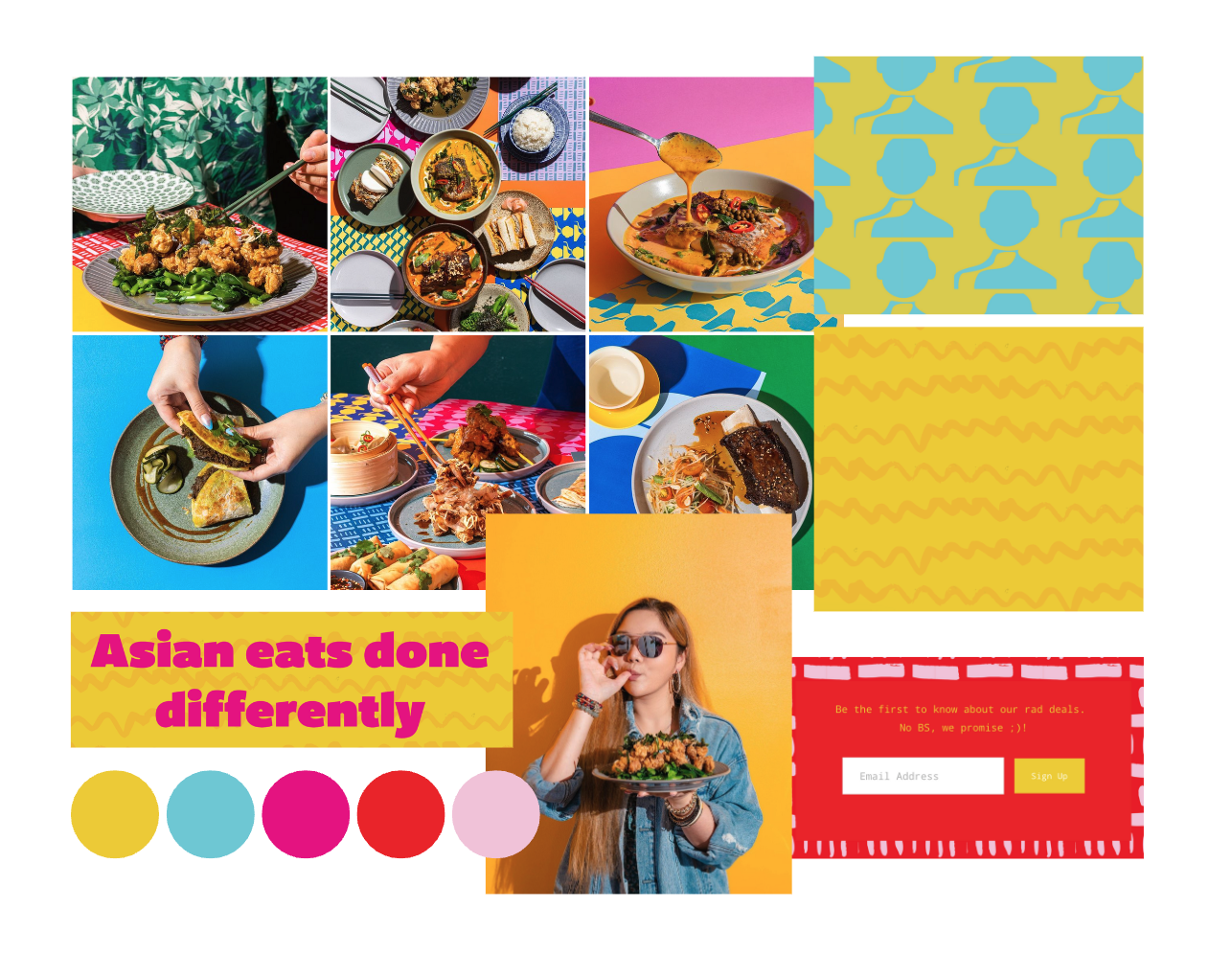
Prepare to be transported into a world where colours collide, patterns dance, and your eyes can't get enough. Bold graphics and patterns take centre stage with Oh Monk’s branding, almost making it hard for your eyes to focus on one thing at a time.
Oh Monk's branding is more than just a visual delight—it's a testament to their commitment to reimagining Asian eats.
SAME SAME
With a crisp and minimalistic approach, sAme sAme captures the essence of contemporary design while sprinkling small touches of Thai influence throughout.

The branding of sAme sAme is a testament to their commitment to creating a dining experience that is both timeless and innovative. Each element has been thoughtfully curated to evoke a sense of refinement, ensuring that every visit is a feast for the eyes as well as the palate.
While sAme sAme embraces a minimalistic aesthetic, it doesn't shy away from infusing subtle Thai influences into their design. Delicate patterns reminiscent of Thai craftsmanship grace the edges, adding a touch of cultural richness to the contemporary setting.
HEY CHU
Hey Chu's branding embraces the art of hand-written design, infusing each element with a personal touch that exudes warmth and authenticity. Boldness and brightness are the hallmarks of Hey Chu's branding.

The hand-written typography captures the essence of Asian heritage, evoking a sense of nostalgia and charm. Hey Chu's branding is a bridge between generations, a celebration of the past with a modern twist. It's a testament to the enduring legacy of Asian culture and a reminder of the beauty that lies in its traditions.
AGNES
Agnes is a contemporary restaurant dedicated to the art of wood fire cooking, and hence, their branding is dark, moody and smoky.

With a dark colour palette predominantly composed of blacks and greys, Agnes emanates an aura of sophistication and refinement. The crisp visuals and minimalistic graphics employed by Agnes further enhance its allure and aesthetic appeal. Every aspect of Agnes, from its sleek design to its meticulous attention to detail, exudes a sense of understated elegance.
SCHILLY STREET
Schilly Street's branding is a captivating blend of casual charm and urban style, where the harmonious combination of wood, brick, and neon forms a visually stunning backdrop that perfectly complements the mouthwatering culinary delights they serve.
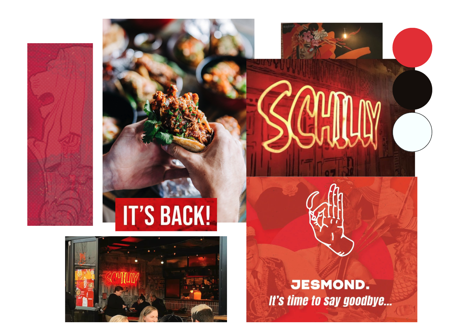
Schilly Street's branding is all about capturing the essence of street culture. The wood and brick elements give a nod to the raw and unfiltered atmosphere of bustling street food markets. It's a reminder that good food doesn't need fancy frills – it's all about the down-to-earth experience that brings people together.
SOKO
Soko's branding exudes an air of exclusivity, transporting you to a world where luxury and the untamed converge. With the phrase, ‘expect the unexpected’, it allows the imagination to run free.

Green dominates the colour palette of Soko's branding, creating a monochrome paradise that echoes the lushness of the jungle. It's a hue that signifies abundance, growth, and a sense of mystique.
This captivating shade signifies abundance, growth, and mystique, immersing customers in a verdant wonderland. From the logo to the interior design, Soko's branding exudes harmony and natural beauty.
CHEEKY POKE BAR
Cheeky's branding serves the crucial purpose of effectively communicating three fundamental aspects: cleanliness, modernity, and health. Each of these elements plays a pivotal role in shaping their brand identity.
Cheeky's branding embraces a modern aesthetic, representing their forward-thinking approach and contemporary appeal. The use of sleek lines, minimalist design, and innovative graphics conveys a sense of cutting-edge style.
This modernity is not only reflected in their physical spaces but also extends to their online presence and digital marketing effort.