Menu Design Psychology
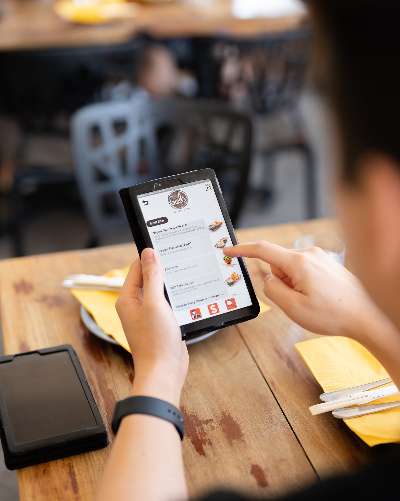
One of the most valuable aspects of marketing your hospo business is a well-thought out menu. For restaurants, a menu is more than just a list of dishes, it’s the reflection of the company. Your brand is your promise. A carefully constructed menu can persuade your customers to buy more through subconscious cues and psychology. If you’re thinking about redesigning your menu or opening up a new restaurant or cafe, it’s important to utilise certain techniques to understand consumer behaviour.
First Impressions Count
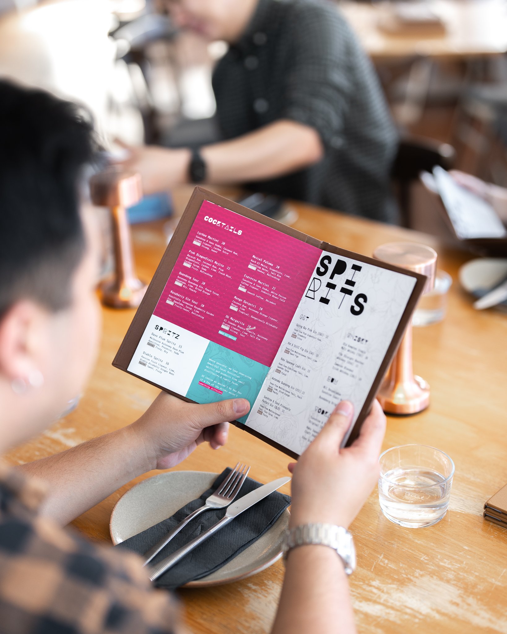
When you first open a menu, where do your eyes go? Most people’s eyes tend to land in the middle first, before travelling to the top right, then finally finishing on the top left. If you want your customers to focus on a specific part of your menu, it’s important to make that section stand out. For example, if you have a dedicated section for your range of burgers, adding them into a box with a different colour - automatically attracts the eye.
Leave it to the Imagination
Under each dish, sits a small description of what that meal entails. This is to entice the customer to try that particular dish. Using superlative claims such as ‘Worlds Best’ tends to be ignored by customers because they think ‘how can that be true?’ Using too many adjectives or descriptive words can really oversell your product. It’s best just to list the ingredients. Another trick, don’t make your list too long. Customers send to get overwhelmed when forced to choose between hundreds of different options. If a menu lists more than six or seven options, it’s difficult for customers to scan.
Storytelling
Research suggests if descriptive labels are used sparingly and appropriately, they can improve sales and post-consumption attitudes of the food and the restaurant. For example, adding words like “Grandma’s” before a dish, such as a lasagne or chocolate pudding, adds an emotion to the dish without the need of a long description. Nostalgia is a powerful force, and using it correctly it’s hard for guests to resist a slice of ‘Nan’s Apple Pie’.
The Art of Decoy Dishes
Using a bracketing strategy, you can allow your diners to compare prices on your menu. Why would you want customers to compare menu options prices? Putting an expensive item between two cheaper options gives the impression that the ‘cheaper’ option, is a bargain. For example, if you have a steak dish priced at $40, it seems much more affordable than the lobster dish priced at $60.
Even high-paying customers will look at menu pricing, so there's a few things you can do. Not putting a dollar signs in front of the price, don’t align prices, same fonts no bolds or italics, text blend in with prices and menu.
What’s Your Highest Profit Margin?
Do you have a dish that you want to sell well or has a high profit margin? A trick when designing menus is to place these items at the top and bottom of their respective list. So, the options you want to sell at the top and bottom of each menu, because that's where the eyesight goes the longest.
Seperate Menu for Desserts
Ever wondered why at most restaurants you only receive your dessert menu after your mains? It's a commonly used tactic for a few reasons. Mainly, it allows your customer to not 'plan ahead', meaning they may order more sides with their mains, rather than leaving room for dessert. Secondly, it allows your guests to have some 'digesting time', so when they eventually look at the dessert menu, one person ordering becomes contagious. Also, it creates a sense that its 'special'.
More Stories


